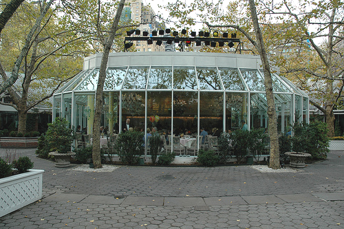
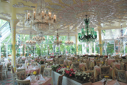
As it turned out, the RSA Plaza building was six stories plus a basement, and enclosed some l50,000 square feet of floor area. Bronner decreed a fast food restaurant on the main floor and a suave “greenhouse glass” banquet type facility on the penthouse level. The latter was to be modeled after the famous Tavern On the Green restaurant which Bronner had frequented in New York (pictured above).
The main lobby, all elevator lobbies, the 5th Floor conference suite, and the penthouse restaurant were to be highly finished and elegant. The office areas were to be nice but economical. The exterior of the main entrance was to be impressive. Improving the image of the State to visiting dignitaries appeared to be the driving force.
But Bronner was still mindful of the licking we all took from his combined Boards in l975, when we presented the initial concept of the RSA headquarters building. Once again he looked to PH&J to evolve a design strategy that would let him carry out his vision, but protect us all from criticism that we were ruining the Capitol Complex.
John Gandy, our chief design architect, laid it out. The building had to be predominantly white concrete, as were the other State buildings. It was only later that the historic preservationists discovered that the Capitol itself was originally buff, not white. John proposed that RSA white would really be as far toward a gray-buff as we could get without being too obvious. The building, especially at the entrance, would be trimmed in polished granite to give it the impressive feel that Bronner wanted.
Gandy proposed two design signatures. First, each building would have a green roof, the color of copper patina. If anyone asked, it was to match the color of the roof on the State Archives building, right across the street from Bronner’s office, and which had a real copper roof that had turned to verdigris. And on each side of the entrance there would be a large polished stainless steel torchere, which we would say were inspired by the two (small unimpressive) torcheres flanking the Adams entrance to the Archives Building. Who could criticize us over such exalted inspiration as might be taken from the much revered State Archives building?
Parking was to be the ultimate in convenience. Every floor of the Plaza would have direct access to a floor of the parking deck. That would produce the most accessible parking in town, but, as would become apparent later, such an arrangement would make building security an impossibility.
Then there was the matter of the building name and street number, to complete the image. Bronner himself came up with the name of the Plaza and of the Alabama Center for Commerce. Because the Plaza building occupied almost an entire block, we had the opportunity (if the City would let us) to give it any even number we wished. The building replaced the old doctor’s office known as “750 Washington”, but we needed a new, fresh number. I proposed the address “700 Washington”, but Bronner was aghast. He said everyone would call it the “700 Club”, a right wing religious TV program which Dr. Bronner wanted no part of. So we settled on 770, and the City expressed no objection to that designation. Obviously the City numbering department had failed to get their “ugly” note from the Mayor.
-Charles Humphries (“Peril and Intrigue Within Architecture”)
This is one of many RSA Plaza stories. The rest can be found here.


Good post. I certainly love this site. Keep writing!